Robert Green, graphic and type designer, on the Doves Type
GB Tell me why you chose this.
RG I’ve spent five years trying to capture its essence digitally. And then I actually found the physical object.
GB When did you first see the font?
RG When I was at college. We studied typography and had to learn letter-press printing, composing and printing using metal type. It’s quite a well-known font but I didn’t really know the story behind it. I’ve since discovered that it’s a fantastically important typeface.
GB How did it strike you the first time you saw it?
RG I can’t remember the first time I ever saw it but about five years ago I was thinking of starting a private press and I was looking for a typeface to use as a signature font. I really wanted to use it but there was no digital version so I decided to revive it myself. Everything else has made the jump from metal through film setting into digital but this one hadn’t.
GB Can you always tell the difference immediately between the original and the digital version of a font?
RG Oh yes. You can always tell a letterpress print from a digital font that’s been litho-printed. You can see that there’s a lot more ink spread, that there’s a deeper impression so the type comes through the back of the paper. There are other clues like the paper and the date it was printed.
GB So what drew you to this one?
RG This one has elegance and struck me as being quite severe. All typefaces have voices and this one has a particularly stentorian voice. A lot of other Venetian types are quite flamboyant.
GB What do you mean by Venetian types?
RG The first alphabets that we would understand today — as opposed to the gothic alphabet — were created by printers in Venice in the late 1400s. There’s more of the hand in Venetian types, they’re slightly more calligraphic than later ones. Many people think the Doves type is based on Nicolas Jenson’s Venetian from 1476, but actually only the upper case is. The lower case is based on type by Rubeus from Venice in the same year. The Doves type pares it down a lot. It still has this beautiful gestural quality in the curves even though the stems are very stiff and mechanical. Turn of the century printers considered early Venetian print over-inked so they took away some of the ink spread. It was commissioned by Thomas James Cobden-Sanderson, with Emery Walker’s know-how, in 1899. One of Walker’s employees, a guy called Percy Tiffin, did the preparatory drawings. You can tell that he had no experience of calligraphy because he doesn’t quite understand gestural strokes. Punches for the metal type itself were cut by Edward Prince, a punchcutter working freelance for type foundries and most of the Private Press movement at the time. It was Prince who really interpreted Cobden-Sanderson’s ideas and brought them to life. Cobden-Sanderson was also reacting to William Morris’s Kelmscott Press. He considered the Golden Type — Morris’s slightly earlier version of “Jenson” which Walker had also facilitated — distracting and overdone. Morris was obsessed by the Medieval period and added a lot of gothic elements to it, whereas Cobden-Sanderson’s type is humanism modernised. Cobden-Sanderson said that “men of to-day, who affect the forms of the past, have their eyes wholly or partially closed.” That’s obviously aimed at his friend Morris.
GB What were they printing at the Doves Press?
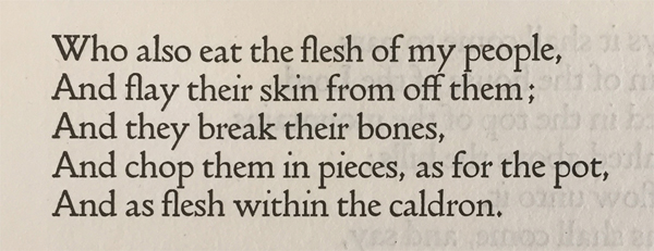
RG They wanted to print “great literary achievements”. Cobden-Sanderson had a whole manifesto for typography and existence in general and got quite caught up in printing broadsides of his own ideas. But the Doves Press is mainly known for its King James Bible and Milton, Goethe, Tacitus, Shakespeare, Browning, Shelley, Tennyson and Keats.
GB So everything was restricted to this one font size? It’s quite big.
RG Yes, it’s 16 point. But of course with my digital version you can change the size. They also had very definite ideas about leading — it’s all set solid in the original. There is no leading except occasionally in the poetry or plays they printed. For the most part the type is just laid on top of itself without leads. Also, unlike now, the kerning (or morticing) couldn’t change without chipping at the type by hand, to alter the spaces between the letters. Because a lot of their spacing would be unacceptable in digital type now I had to make concessions. The “y” was very controversial because some people thought it was too aggressive. It gave me a lot of problems because the right stroke that goes down to the tail is quite thick compared to the similar stroke in the “v”. That would be unacceptable nowadays. When you make it perfectly even, the negative space starts to look wrong, so there’s a fine balance to find. The serifs give you a sense of direction of where the characters go so if you’re looking at something quickly it’s easier to read, you’re not just looking at a load of geometry. But the Doves type is very severe and there are few flourishes or decoration in Doves’ presswork, it’s limited to sparing use of calligraphic initials & headlines by Edward Johnston. Johnston went on to devise the London Underground type.
GB How did it end?
RG Walker and Cobden-Sanderson fell out and a lot of subscribers melted away with Walker so the Press was always in trouble. The partnership was dissolved in 1909. Cobden-Sanderson ended up throwing all the metal type into the Thames in 1916-17. Walker is a towering figure in typography and it was Walker who had reignited William Morris’s interest in printing. His ideas about typographic history are probably responsible for a lot of the type revivals that we’re all familiar with now. One concern in the 19th century was to fit as much type into a small space as possible. Type had become more mutated — with highly contrasted strokes and proportions changing over years it got uglier. That’s why old types were revived. Before the Kelmscott Press the only really effective revival was of Caslon, which wasn’t initially modernised — in the 1840s the Chiswick Press just took the original punches and recast it. The foundries followed the fashion for Caslon and devised a sort of exaggerated Victorian version, known as Old Style. Then after the Golden Type in the 1890s a lot of foundries copy William Morris’s “Jenson”. Everything gets thick and chunky and slightly Medieval. The Doves Press comes along in 1900 and a flood of revivals follow, all pared down and modernised as Cobden-Sanderson had prescribed for Doves. The ink spread is taken out and everything becomes sharp but subtle. The Doves type is the first one to consciously do this with a classic form. It’s Cobden-Sanderson’s final creative enterprise but Walker goes on to advise figures like Bruce Rogers, T.E. Lawrence (of Arabia) and Monotype’s Stanley Morison, the man responsible for Times New Roman and revivals of Baskerville, Bembo and Garamond.
GB What makes a typeface beautiful to you? Is it legibility or closeness to handwriting?
RG For me, it’s completely visceral and any intellectual idea about it comes after. If I’m drawn to something I’ll work out why. Doves type has mechanical as well as gestural elements. But who can say why it’s beautiful when you see it? It does have a kind of spirit, even though I don’t believe in that stuff. There’s some kind of background hum going on with the story and the history and its fate. It has an incredible charisma.
GB Is the digital version your default font?
RG No, I hardly use it. I don’t have a default font any more than I have a default aesthetic. One guy who bought it told me he wrote a letter to his bank manager in 16 point Doves. That’s not really what it’s for. Fonts like Helvetica are adaptable to many uses. I don’t think this one is. It was invented with a rationale behind it to present great achievements in Western literature. Any type works on a lot of levels. It has a personality and the application of it should be a consideration. You can’t use Comic Sans to write a letter to a bereaved person. The form is essentially jaunty. I think Helvetica is fine for emails but if you’re writing a letter to someone, it should really be in a serif typeface. I’d probably go for Garamond for a letter.
GB What makes something worthy of the word Beauty to you?
RG Things that are beautiful in art and craft and literature on “first read” somehow convey all the work and thought that have gone into them subconsciously. I don’t think you can create something beautiful without working quite hard, even if that’s all at the front end – taking a life’s experience and spending ten minutes on doing something. That comes through in this typeface. Because it’s so accomplished you can’t even see the work that’s gone into it. When I started working on it I found that there are no simple components to it, but hundreds of bits of invisible geometry. That’s why it took years to complete.


Leave a comment